Client
L’Arche
Rol
Product Design Lead · UX/UI Design
Field
Third sector
Year
2024
Introduction
As part of the rebranding project, the client decided to review their web ecosystem in order to integrate the new visual identity and optimize the user experience. The main objective was to centralize the offering; their extensive portfolio was divided into different portals, which created confusion and consequently led to low participation from new benefactors.
In this project, I served as the Product Design Lead within The Imageniers' design team.
result
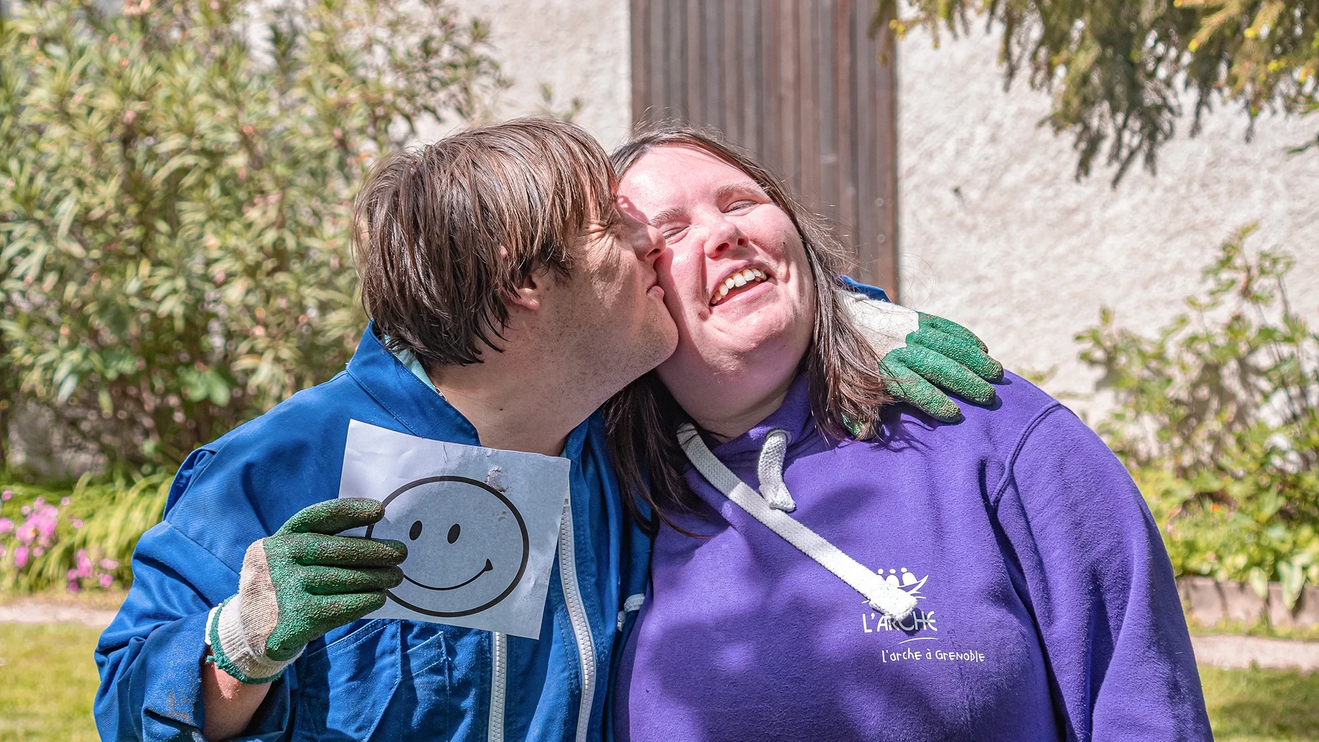
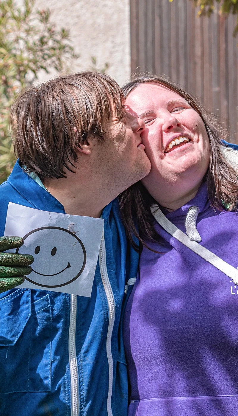
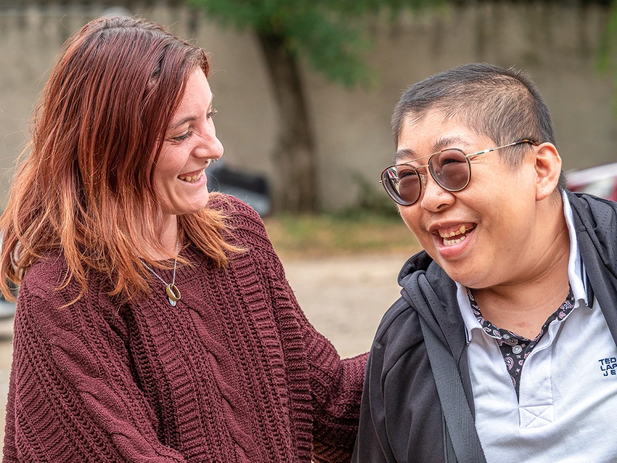
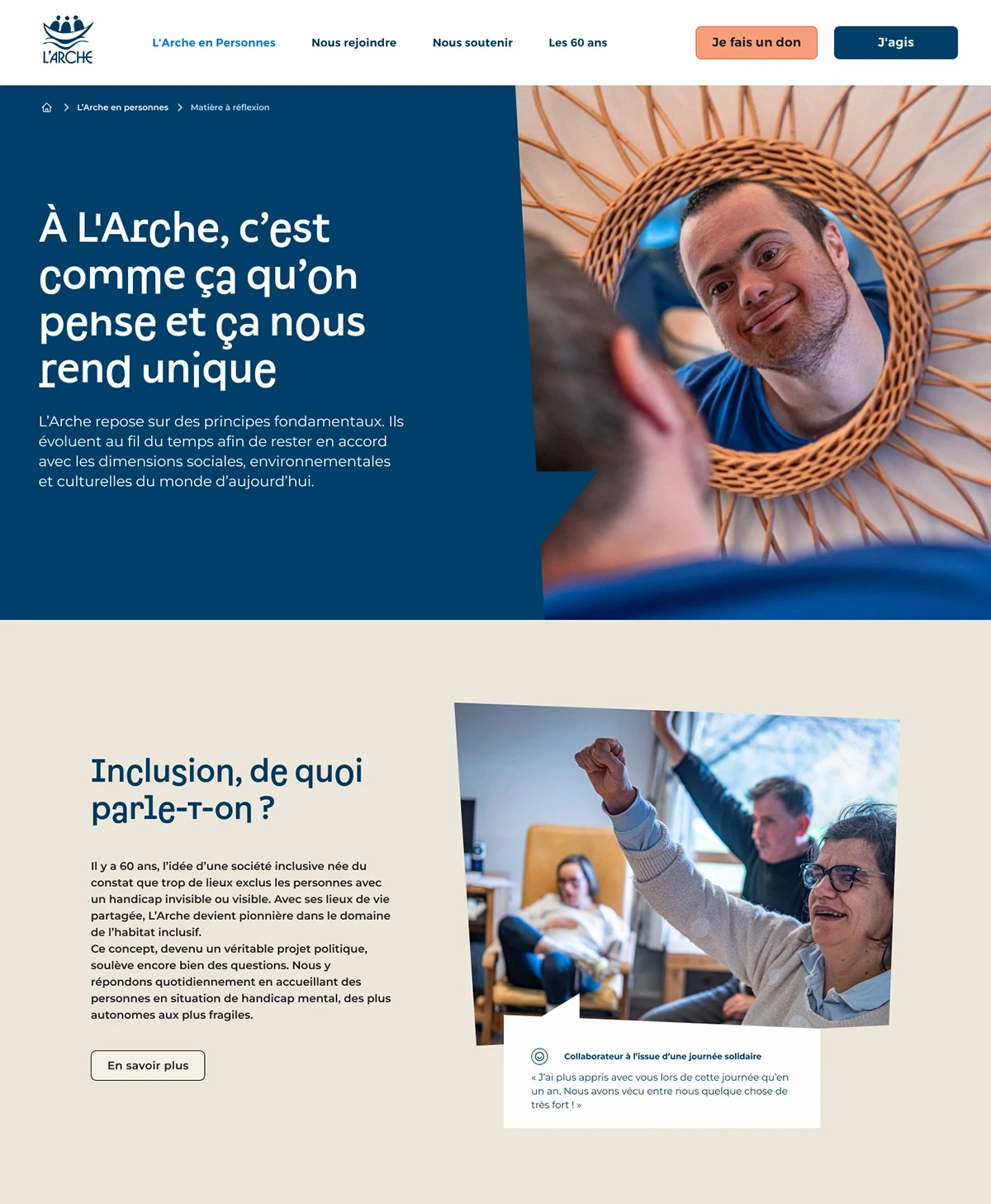
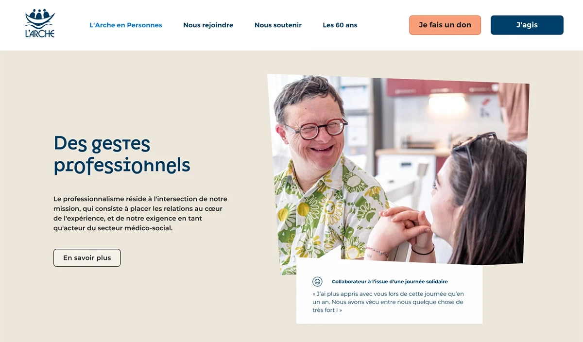
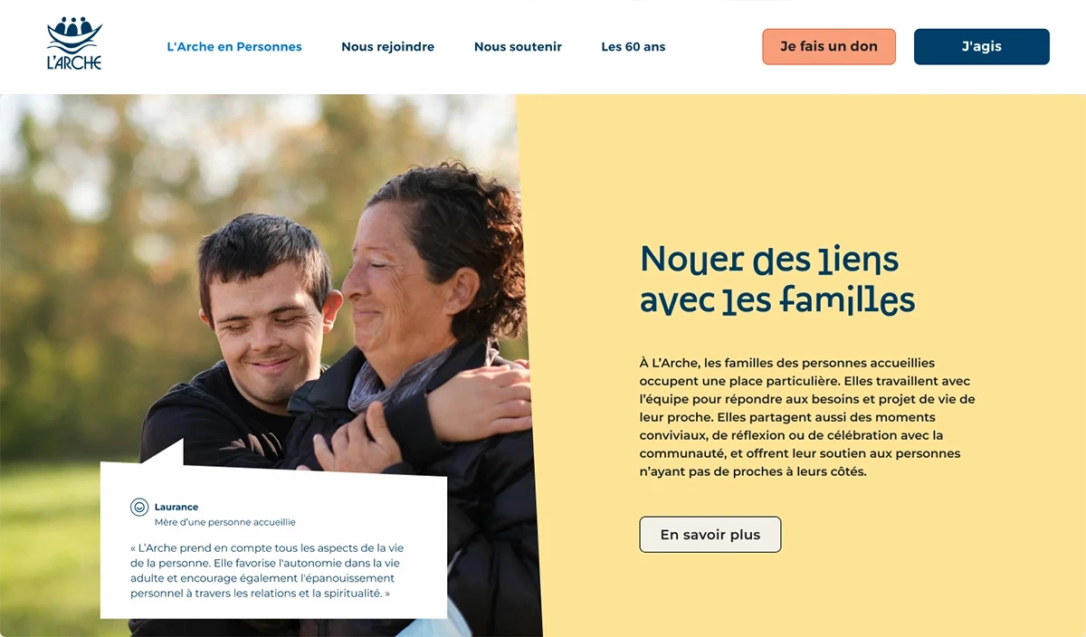
Inspired by L'Arche's spirit of coexistence and the diversity of the new visual identity, we created a people-centric website. We designed interactive spaces where photography, copy, and testimonials weave compelling narratives. This approach amplifies the voices of beneficiaries and showcases the positive impact of those contributing to the project.
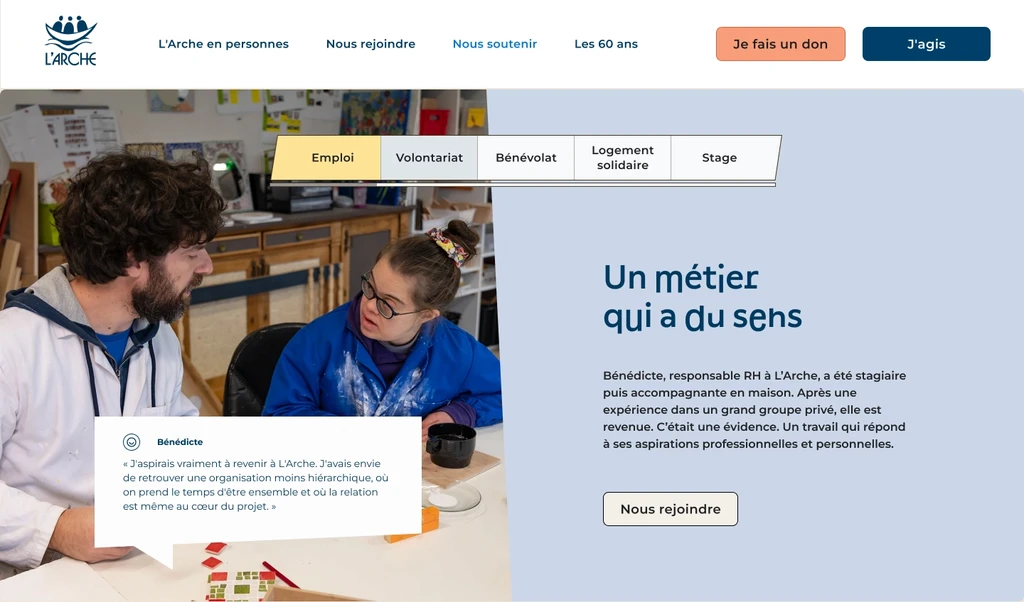
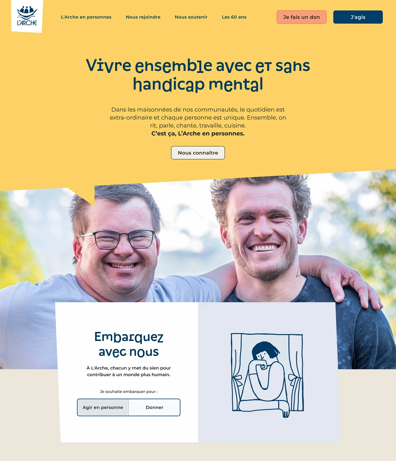
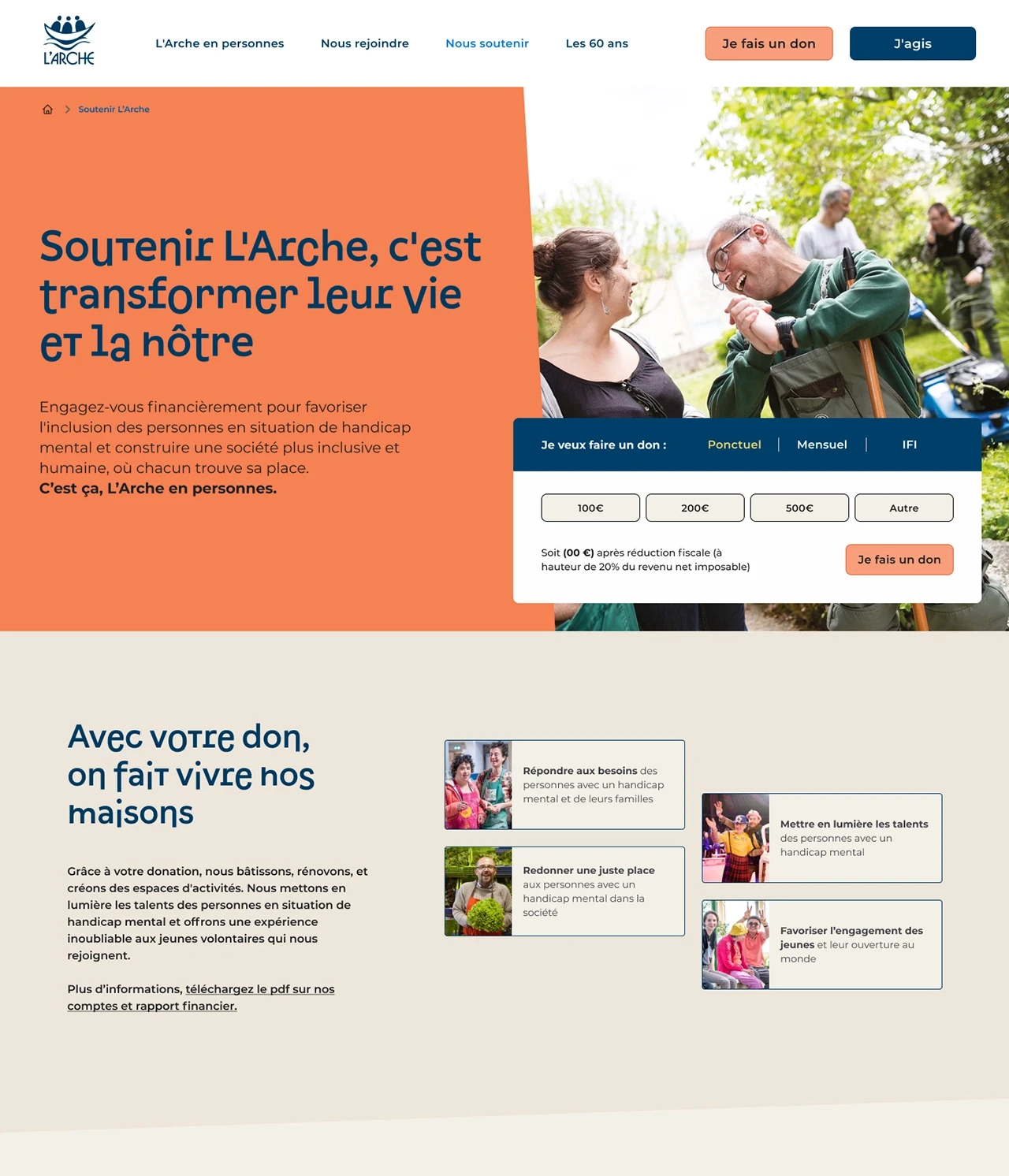
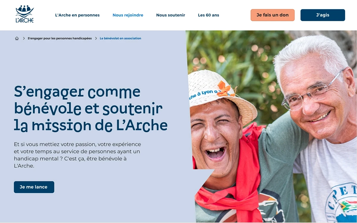
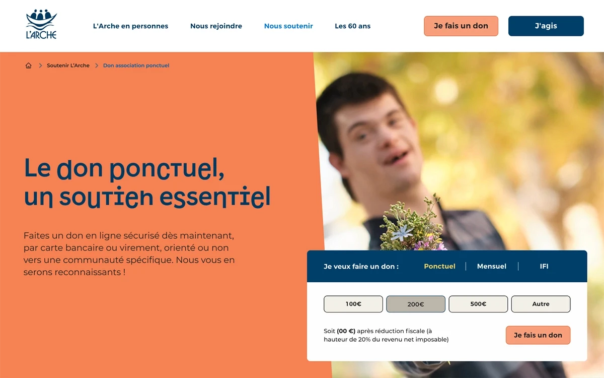
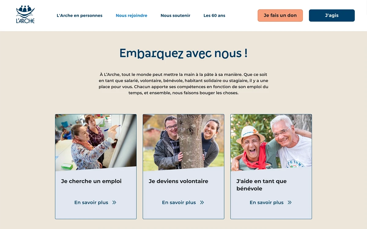
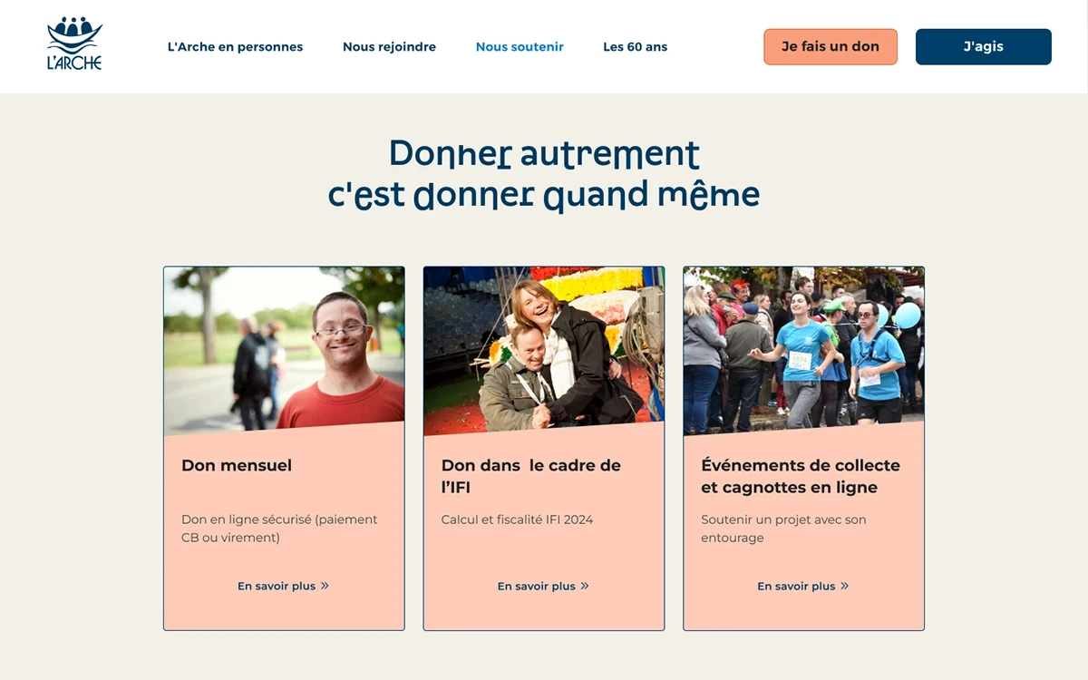
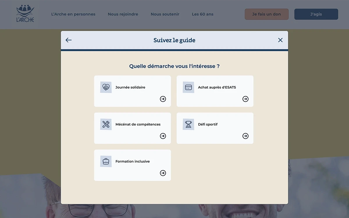
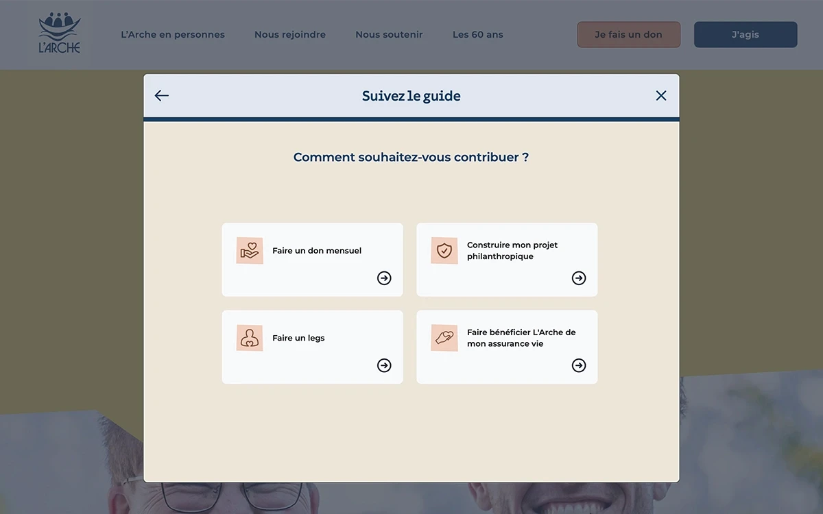
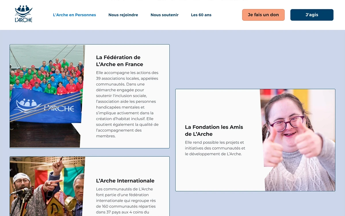
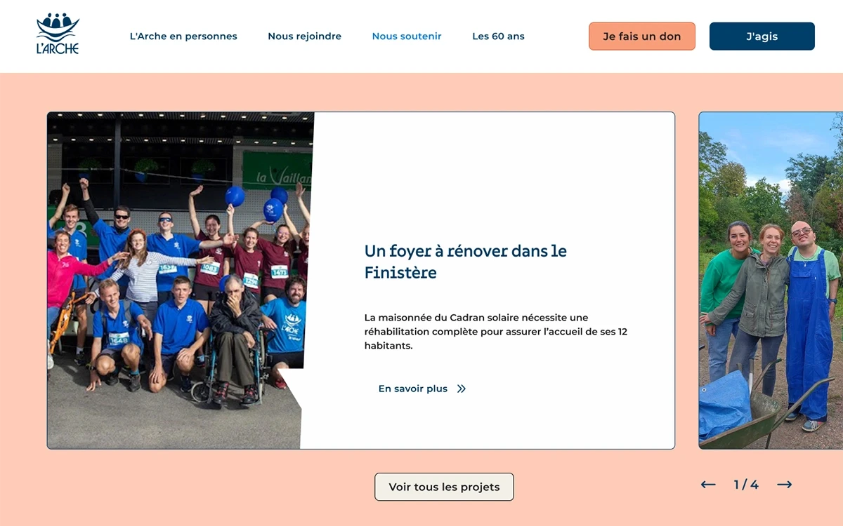
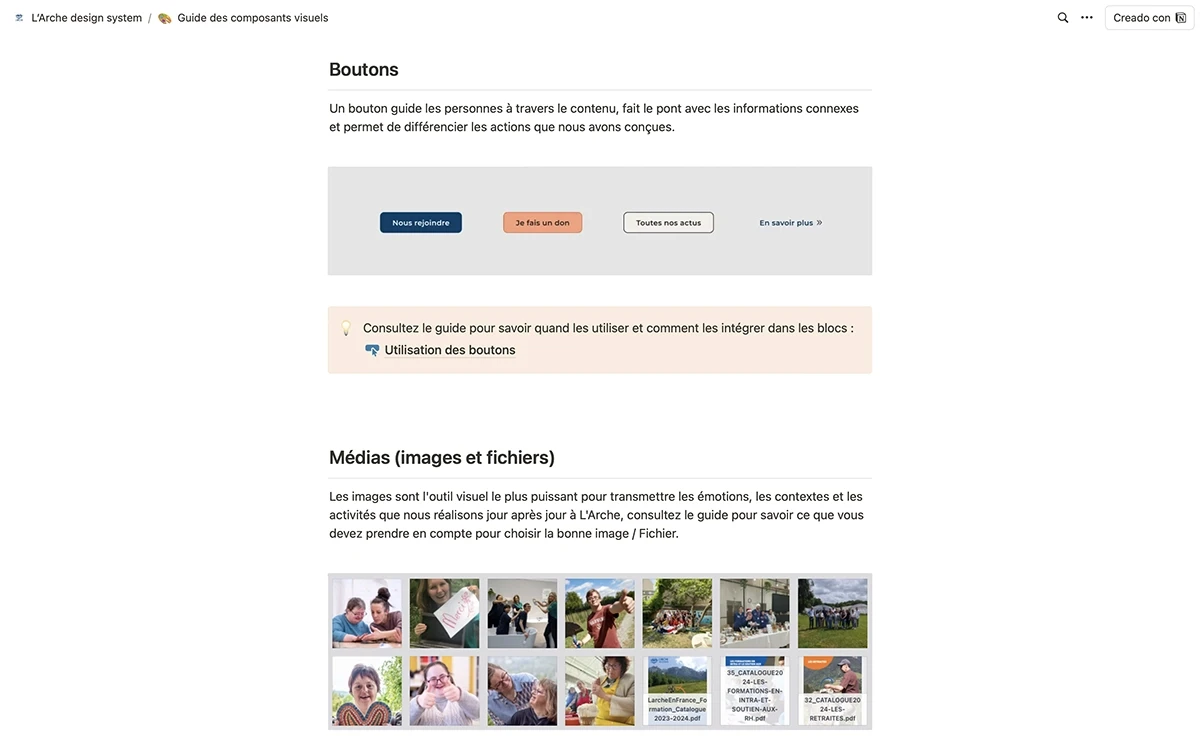
After revamping the website structure and conducting user tests, we recognized the need for a navigation menu that clearly distinguishes the various ways to participate in the project. We created dedicated sections for engagement, donations, and a guide. To reinforce this, we placed "Call-cards" throughout the pages—messages that encourage users to explore information more deeply or reach out to the team.
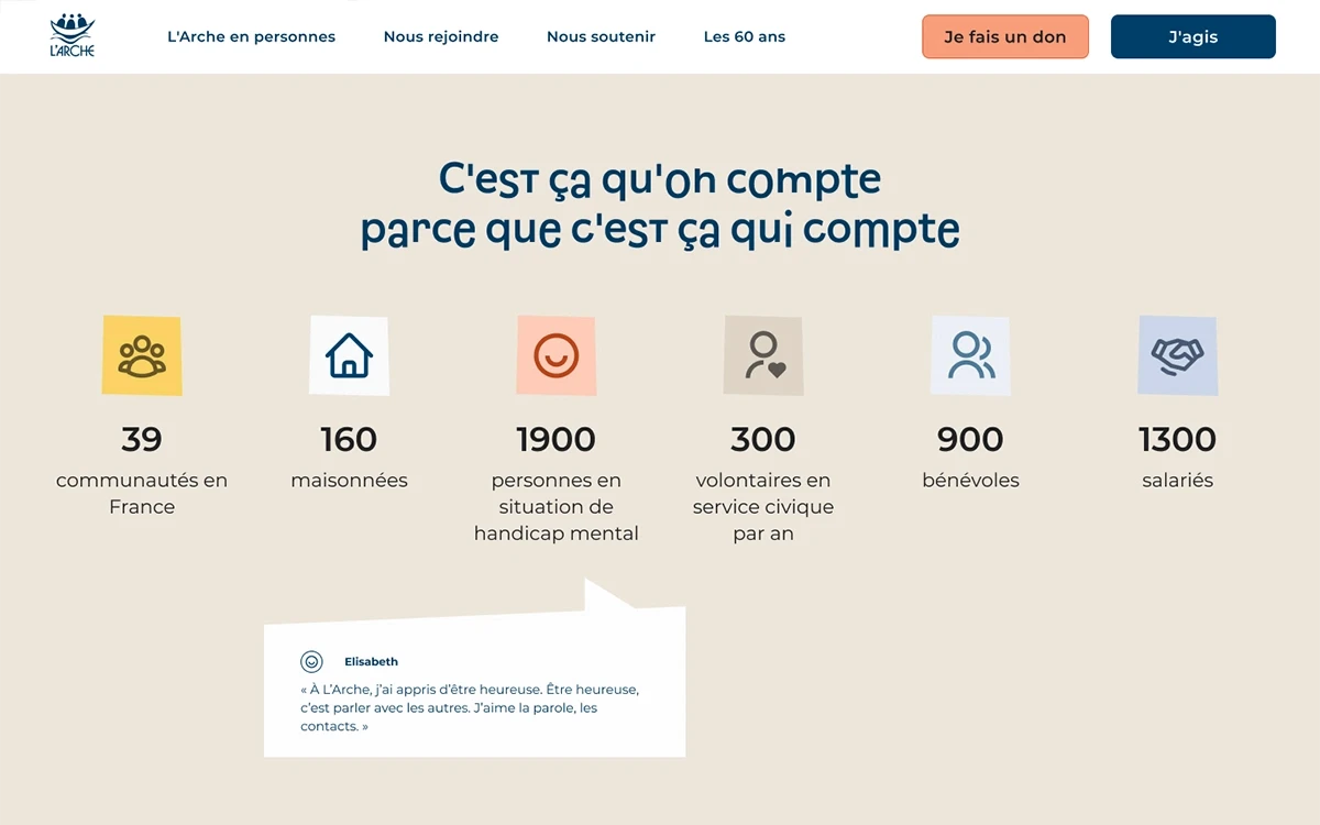
Honesty and transparency are core values for potential participants, which is why testimonials feature prominently throughout the website. By showcasing experiences from workers, volunteers, entrepreneurs, and people with disabilities, we highlight the foundation's human-centric approach. These personal stories effectively convey the benefits of joining the project, reinforcing L'Arche's authentic character.
Leveraging L'Arche's extensive color palette, we chromatically reinforced the participation options: donations are associated with *salmon orange*, while engagements are linked to *steel blue*. This color-coding guides users through the Gestalt principle of similarity, enhancing intuitive navigation.
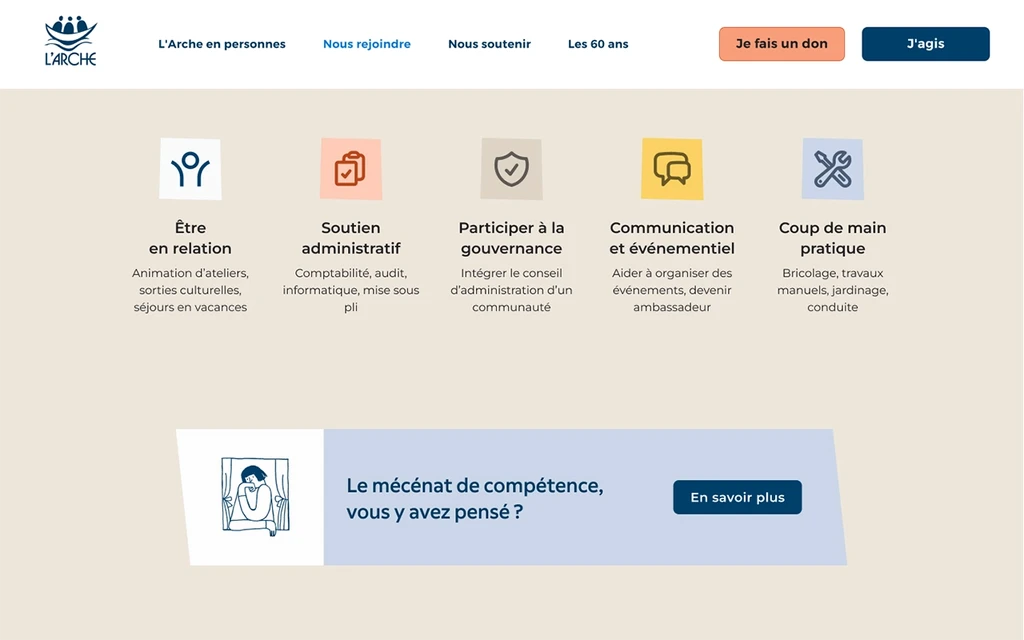
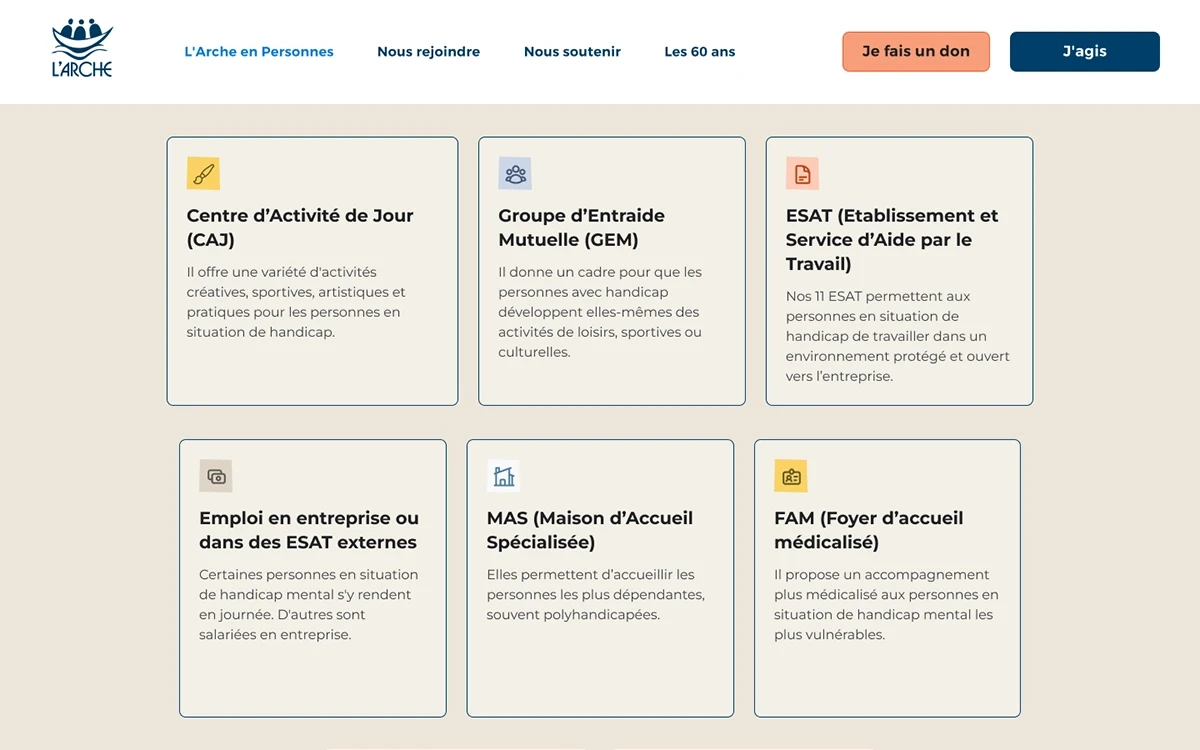
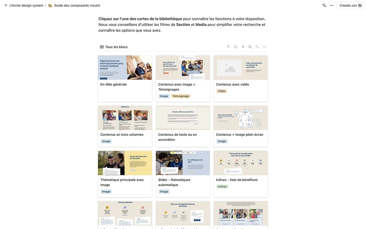
A project of this scale has numerous stories to tell and data to showcase. We created a diverse system of dynamic blocks to help the client present information in various ways. This system optimizes the website's reading flow, standardizes the type of information to be uploaded, and sparks the client's creativity.
To ensure the 39 communities' digital teams could effectively adopt the new web ecosystem, we created a design system in Notion. This system focuses on teaching WordPress content management in a didactic and illustrated manner. While the teams had prior experience with WordPress, they needed guidance on the new website's specific logic and structure.
Anticipating the website's growth, we developed a block library. This resource provides detailed explanations on how to leverage the designed elements, guides users through the creation and editing processes, and connects various components of the system.
Leading a project of this magnitude—with multiple teams and tight deadlines—was a first for me. I decided to implement the Scrum methodology, taking on the role of Scrum Master. This decision led to more coherent project management. I learned the importance of motivating people, trusting them, and adopting a pragmatic approach in high-effort projects. The experience deepened my understanding of effective leadership in complex, time-sensitive environments.
As a product design lead, it's crucial to address challenges arising from tight deadlines and project uncertainties. Investing time in workflow planning and carefully selecting appropriate tools and resources is key to agile effort management. This proactive approach ultimately saves considerable time throughout the project lifecycle.